EastLondonMike Posted November 1, 2020 Share Posted November 1, 2020 8 minutes ago, theswanmcr said: Interesting in the spiel that It has been 12 months in the planning, with all levels of the club were consulted... but no fans! As it is no one has anything invested in it, they’ve had no time to take on board why this is being done etc This is how you should redesign a logo... https://www.itv.com/news/westcountry/2019-03-27/bristol-city-unveils-new-badge I think fans were consulted. If you scroll down to the bottom of the mini site there is a section called 'The Process", flick through that to see what the process involved. Which seems quite well thought out, just very badly executed. Newham Dockers - Champions 2013. Rugby League For East London. 100% Cockney Rugby League!Twitter: @NewhamDockersRL - Get following! www.newhamdockers.co.uk Link to comment Share on other sites More sharing options...
Chrispmartha Posted November 1, 2020 Share Posted November 1, 2020 Deary me, that’s all kinds of wrong. Link to comment Share on other sites More sharing options...
Damien Posted November 1, 2020 Share Posted November 1, 2020 14 minutes ago, Hela Wigmen said: Immeasurably better. If we are going with a modern twist it is a big improvement on what they have come up with. Link to comment Share on other sites More sharing options...
Chrispmartha Posted November 1, 2020 Share Posted November 1, 2020 5 minutes ago, EastLondonMike said: I think fans were consulted. If you scroll down to the bottom of the mini site there is a section called 'The Process", flick through that to see what the process involved. Which seems quite well thought out, just very badly executed. Totally agree, the idea behind wanting a more modern (and it seems more easily replicated on clothing snd digital/print) is totally valid. what they’ve ended up with is just a bit ######. Link to comment Share on other sites More sharing options...
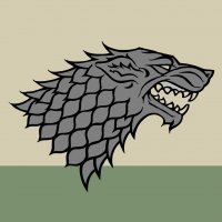
Chrispmartha Posted November 1, 2020 Share Posted November 1, 2020 Why has it got cats ears? Link to comment Share on other sites More sharing options...
EastLondonMike Posted November 1, 2020 Share Posted November 1, 2020 22 minutes ago, Chrispmartha said: Totally agree, the idea behind wanting a more modern (and it seems more easily replicated on clothing snd digital/print) is totally valid. what they’ve ended up with is just a bit ######. It's all about the Viking for me(what does a warrior look like anyway?!).. The circular crest and use of the font i could live with (even if they have used different sized fonts for the main wording). This does work well across other sports brands. The Manchester City branding is i think a good example of this, creating a contemporary brand from a traditional and historic crest. It's not amazing in terms of design, but it ticks the boxes and has a nice clean aesthetic. The first question i think that should have been asked should have been around the use of the moniker of 'Warriors'. What is its purpose? what are its real benefits? Is it really required for a club like Wigan? Obviously the cross section of wigan fans they spoke to gave a more favourable response to changing the branding completely to keeping it more traditional. I'd really love to see this brief that was pulled together by Robin consultancy. Just because you've gone through a year long process and paid a large sum of money (no doubt), if something is broken, you get it fixed. If Wigan had any sense they would be back on the phone with Nomad to re-assess with a view to creating an improvement for 2022.. but then some genius went and ordered a new kit and new apparel range with the new branding on.. and in many cases people are too reluctant to admit when they've created a stinker, and would rathe live with it then get it fixed ASAP. Newham Dockers - Champions 2013. Rugby League For East London. 100% Cockney Rugby League!Twitter: @NewhamDockersRL - Get following! www.newhamdockers.co.uk Link to comment Share on other sites More sharing options...
theswanmcr Posted November 1, 2020 Share Posted November 1, 2020 5 minutes ago, Chrispmartha said: Why has it got cats ears? Ha. When it is squashed down In size all I see is an octopus with tentacles! Link to comment Share on other sites More sharing options...
Chrispmartha Posted November 1, 2020 Share Posted November 1, 2020 4 minutes ago, EastLondonMike said: It's all about the Viking for me(what does a warrior look like anyway?!).. The circular crest and use of the font i could live with (even if they have used different sized fonts for the main wording). This does work well across other sports brands. The Manchester City branding is i think a good example of this, creating a contemporary brand from a traditional and historic crest. It's not amazing in terms of design, but it ticks the boxes and has a nice clean aesthetic. The first question i think that should have been asked should have been around the use of the moniker of 'Warriors'. What is its purpose? what are its real benefits? Is it really required for a club like Wigan? Obviously the cross section of wigan fans they spoke to gave a more favourable response to changing the branding completely to keeping it more traditional. I'd really love to see this brief that was pulled together by Robin consultancy, whoever they might be. Just because you've gone through a year long process and paid a large sum of money (no doubt), if something is broken, you get it fixed. If Wigan had any sense they would be back on the phone with Nomad to re-assess with a view to creating an improvement for 2022.. but then some genius went and ordered a new kit and new apparel range with the new branding on.. and in many cases people are too reluctant to admit when they've created a stinker, and would rathe live with it then get it fixed ASAP. Thing is I’m all for change and modernising through branding and ‘pushing the envelope’ as us designer types say. But this just seems totally ill judged. Link to comment Share on other sites More sharing options...
Leeds Wire Posted November 1, 2020 Share Posted November 1, 2020 2 hours ago, Nate90 said: The logo design looks like something from Clip art. Not a fan of that badge at all, I have never been one for calling Wigan, warriors Nobody who paid to watch them play live ever, ever called them 'Warriors'. Ridiculous badge - looks like an angry, drunk Viking. Link to comment Share on other sites More sharing options...
EastLondonMike Posted November 1, 2020 Share Posted November 1, 2020 5 minutes ago, Chrispmartha said: Thing is I’m all for change and modernising through branding and ‘pushing the envelope’ as us designer types say. But this just seems totally ill judged. Compare the amount of complaints Wigan would have had from fans about the old branding, to the amount they will have gotten already about the new branding.. Very Ill judged and poorly executed, it has to be said. My fear now is that other clubs follow suit and employ the same process utilising the same consultancy and creative agency. And we haven't even got onto the subject of the new Wigan kit!.. Newham Dockers - Champions 2013. Rugby League For East London. 100% Cockney Rugby League!Twitter: @NewhamDockersRL - Get following! www.newhamdockers.co.uk Link to comment Share on other sites More sharing options...
The 4 of Us Posted November 1, 2020 Share Posted November 1, 2020 3 hours ago, EagleEyePie said: I'd like to congratulate Wigan's marketing department on creating a new Widnes badge and putting it on the best Salford shirt in years. Now I'd like to see what they can do with our iconic crest and traditional and recognisable colours of cherry and white... Thought we were due a trad one this cycle? Even more interesting than the Denis the Menace shirt is what appears to be a new main sponsor! https://www.eu-startups.com/2020/07/monte-carlo-based-iqoniq-secures-e100-million-to-expand-its-sports-fan-engagement-platform-worldwide/ Reckon someone is going to get struck off the club Christmas card list for leaking that! As for respecting traditions I think the new look is the equivalent ripping off the shirt and wiping your ‘arris on it! I just wonder with the line up of backing in Iqoniq whether this is start of the “investment” ? http://www.wiganstpats.org Producing Players Since 1910 Link to comment Share on other sites More sharing options...
Chrispmartha Posted November 1, 2020 Share Posted November 1, 2020 Cherry and white hoops from the kit were so important that they put them in the badge but not the kit Link to comment Share on other sites More sharing options...
The Hallucinating Goose Posted November 1, 2020 Share Posted November 1, 2020 20 minutes ago, theswanmcr said: Ha. When it is squashed down In size all I see is an octopus with tentacles! As opposed to an octopus without tentacles? Link to comment Share on other sites More sharing options...
Tommygilf Posted November 1, 2020 Author Share Posted November 1, 2020 19 minutes ago, Celt said: I knew it looked generic! Link to comment Share on other sites More sharing options...
Leeds Wire Posted November 1, 2020 Share Posted November 1, 2020 1 hour ago, Damien said: So it wasn't a joke then and this is actually happening. They couldn't have done worse if they'd tried. I agree. Probably the most iconic team in our sport and they missed the elephant in the room - what a fantastic opportunity to rebrand by dropping the useless Warriors moniker and it went over all of their heads. Link to comment Share on other sites More sharing options...
Wiltshire Rhino Posted November 1, 2020 Share Posted November 1, 2020 I don't mind it... ...but then again I'm never going to wear it. 2014 Challenged Cup Winner Link to comment Share on other sites More sharing options...
M j M Posted November 1, 2020 Share Posted November 1, 2020 34 minutes ago, Celt said: Nah I think they looked a little closer to home. Link to comment Share on other sites More sharing options...
Angelic Cynic Posted November 1, 2020 Share Posted November 1, 2020 I was of the opinion that former players may not make good CEO's. But it may be Elstone and his ideas for Super League is where the problem lies. https://www.yorkshirepost.co.uk/sport/rugby-league/chief-executive-robert-elstone-excited-super-leagues-rebrand-1755948 No reserves,but resilience,persistence and determination are omnipotent. Link to comment Share on other sites More sharing options...
Leeds Wire Posted November 1, 2020 Share Posted November 1, 2020 4 minutes ago, Wiltshire Rhino said: I don't mind it... ...but then again I'm never going to wear it. Don't get me started on the stupid "Rhinos" name. It's just embarrassing. Link to comment Share on other sites More sharing options...
Hela Wigmen Posted November 1, 2020 Share Posted November 1, 2020 6 minutes ago, Leeds Wire said: Don't get me started on the stupid "Rhinos" name. It's just embarrassing. Haven’t you seen the wild Rhinos frolicking around Roundhay Park then? Link to comment Share on other sites More sharing options...
Tommygilf Posted November 1, 2020 Author Share Posted November 1, 2020 11 minutes ago, Angelic Cynic said: I was of the opinion that former players may not make good CEO's. But it may be Elstone and his ideas for Super League is where the problem lies. https://www.yorkshirepost.co.uk/sport/rugby-league/chief-executive-robert-elstone-excited-super-leagues-rebrand-1755948 I don't think the idea of modernising identities and making stuff like badges more digital friendly is a bad thing at all. This is just a poor effort at that. Link to comment Share on other sites More sharing options...
Henson Park Old Firm Posted November 1, 2020 Share Posted November 1, 2020 15 minutes ago, Hela Wigmen said: Haven’t you seen the wild Rhinos frolicking around Roundhay Park then? Yes I have... It's called my mother in law Link to comment Share on other sites More sharing options...
Chrispmartha Posted November 1, 2020 Share Posted November 1, 2020 4 minutes ago, Tommygilf said: I don't think the idea of modernising identities and making stuff like badges more digital friendly is a bad thing at all. This is just a poor effort at that. Exactly i agree with Elstone to be honest, most SL clubs need to update their Identities IMO, however what Wigan has done has totally backfired and for good reason. whats very telling is the amount of tweets and content they’re putting out to try and explain why they’ve done it, but it’s just making it worse. Link to comment Share on other sites More sharing options...
JohnM Posted November 1, 2020 Share Posted November 1, 2020 Four pages about a club badge? Shows the club can still attract admirers. 🖒🖒🖒🖒 Link to comment Share on other sites More sharing options...
Hela Wigmen Posted November 1, 2020 Share Posted November 1, 2020 Spose they didn’t get permission from their landlords to do it at their ground, so have had to use someone else’s. Link to comment Share on other sites More sharing options...
Recommended Posts
Archived
This topic is now archived and is closed to further replies.