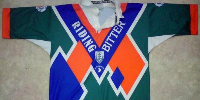
In this week’s edition of Six of the Best, we’re taking a trip down memory lane to find those Rugby League kits that stick firmly in the memory. It’s inspired by a move from NRL clubs earlier this week, who have teamed up with Marvel to produce some eye-catching kits for the likes of England star Gareth Widdop.
They certainly are different, so we decided to throw the court open to you on social media, and ask you what your most memorable kits – be it good ones or bad ones – are. We had plenty of suggestions, but here are the six that made the cut! All the kits can be viewed in full at the bottom of the article.
Hull KR
This one was suggested to us on Twitter by Dave Matthews (@DaveHKR), and it certainly does rank as different! Dave said he hated it at the time, but it certainly left enough of an impact on him to stick in his memory, and we can see why! Green, orange blue isn’t a colour combination you’d associate with Hull KR on too many occasions, but the club rolled this outstanding effort out once upon a time..
Leigh Centurions
Another radical kit suggested to us by one of our Twitter followers, and another from a team that usually play in red and white! Leigh fan John Dickinson (@JohnD87MCFC) sent us this shot of a Leigh kit with a bit of a difference; as the traditional red and white was switched for a peculiar red, white and blue harlequin pattern!
Huddersfield Giants
This one got plenty of nominations for being a real off the wall kit; and we can certainly see why! Back in 2012 Huddersfield decided to shock the Rugby League world by going for a grey kit accompanied with what looks like a paint splash, as well as a few stars for good measure! Unfortunately it didn’t have the desired response, as the Giants failed to secure a trophy.
Bradford Bulls
Plenty of calls from Bradford Bulls fans over their outrageous kits, including their yellow shirt in the late 1990s, and their green shirt they wore in 2006. But the Bradford shirt that got the most votes was one of their last shirts as Bradford Northern in the 1990s. Green, purple and white is something you’re used to seeing from a continental soccer team, but Northern wore this shirt with great distinction in the 90s.
New Zealand Warriors
There was an eye-catching design or two from the NRL Nines earlier this year, and we had lots of suggestions for the New Zealand Warriors shirt they wore during the tournament. Blue and white is perhaps a common kit design, but the Warriors went all out in making they stood out with some eccentric designing!
Wigan Warriors
Even Wigan aren’t exempt from a poor kit or two, it seems. Out of all the suggestions we had, the most came in for this 2011 selection; a year in which they won the Challenge Cup. Still, that didn’t stop you all from going against the choice of jersey; as the traditional cherry and white was ditched (to an extent) with the colours almost merging together. It’s certainly different!