AS part of our Super League previews in the last issue we showed the array of colours and designs the 12 top-flight sides will be wearing in 2025.
Space didn’t allow for us to do the same for clubs in the Championship and League One, and looking across those leagues there are some smart and classy shirts on display.
Here are just six of the ones that have caught our eye in the early stages of the season.
BARROW RAIDERS
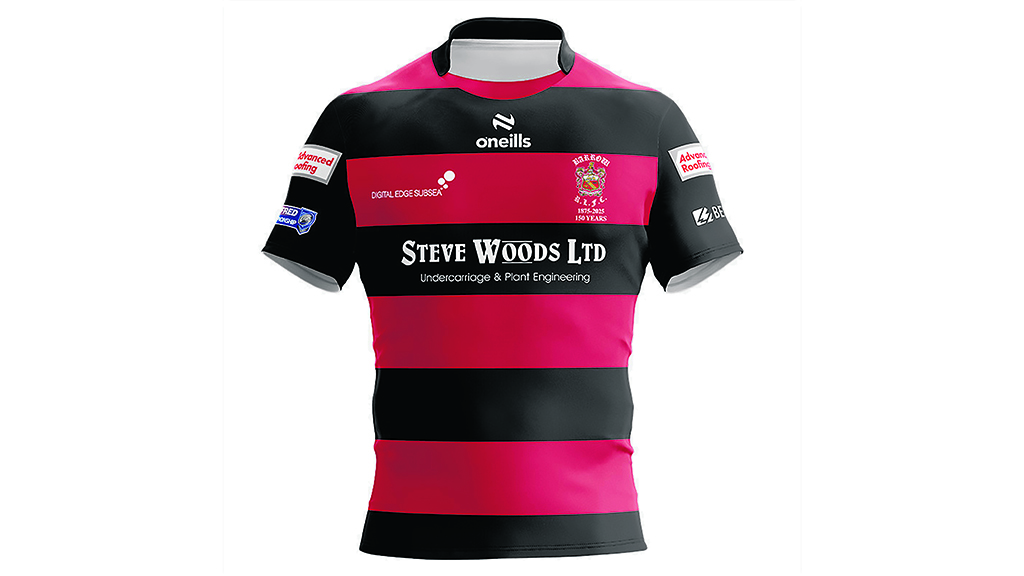
IT might take a bit of getting used to not seeing Barrow playing in a traditional blue and white home kit in 2025, but the club have decided to mark their 150th season with this special red and black commemorative shirt that mirrors the kit worn by the very first Barrow team in 1875.
These remained the Cumbrian club’s colours until the end of the 1937/38 season, when they wore the then alternate blue and white strip for much of the journey to Wembley in a successful Challenge Cup run. They subsequently made that their home colours.
The club’s early heritage is also recognised with a return to the original club badge from their pre-Raiders days.
FEATHERSTONE ROVERS

ANOTHER club using their home shirt to mark their heritage is Championship side Featherstone Rovers.
However, they are not celebrating the history of the club, instead they are paying tribute to the area’s proud coal mining past.
We’re not sure if we’ve ever seen a shirt quite like this before, but the incorporated coal tower and pit pony silhouette design certainly makes for a striking and unique look.
While the bottom half of the shirt could have proved very dark blue heavy, the incorporation of lighter blue chevrons down each seam certainly breaks that up.
HUNSLET
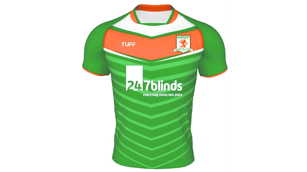
LOOKING at this shirt you are left in no doubt that it belongs to newly-promoted Hunslet, with their famous myrtle, white and flame colours incorporated into a fresh new design.
This colour combination always works well together and gives the South Leeds club a real sense of identity.
The deep chevron across the chest retains elements of a classic rugby league shirt, but the green body broken up by the paler green chevrons of varying widths adds a modern twist.
The same colour combination on a largely black away shirt ensures that wherever and whenever Hunslet turn out this year, you’ll know who you are watching.
BRADFORD BULLS
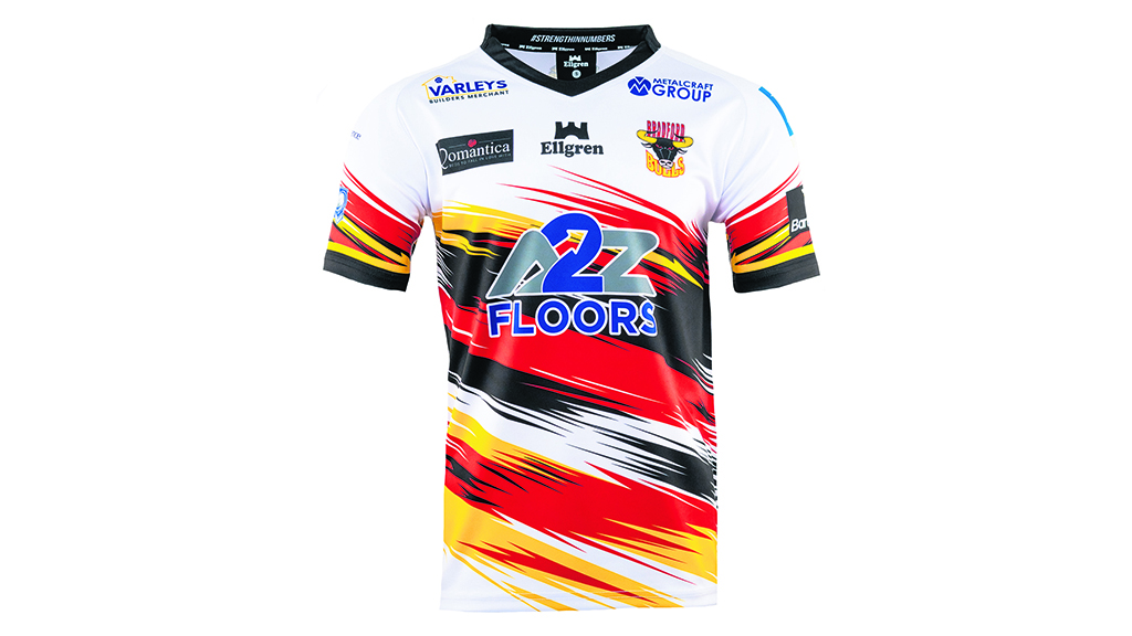
WE’RE not always big fans of the more abstract ‘colour splash’ shirt designs.
Often it can end up looking like there has been an explosion in a paint factory, but Bradford Bulls have managed to find a way of making that look work.
Sticking with the club’s famous ‘Red, Amber and Black’ combination, the interlocking flashes of colour over much of the front of the shirt give the Bulls a fresh modern look, and with a more traditional away shirt as an alternative, the club could perhaps afford to take a chance on this new design.
Has it paid off? Not everyone will think so, but we certainly do.
GOOLE VIKINGS
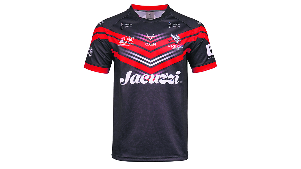
LEAGUE One newcomers Goole Vikings will certainly look the part during their debut season as a professional club in this sleek and classic home shirt.
On the surface, it appears the Victoria Pleasure Ground will see the team run out in a simple black shirt with a red chevron design, which is broken up by thinner white and red chevrons that fade away into black.
But if you look closer, the body of the shirt features a subtle Viking pattern motif that adds a hidden layer of detail to mark the club’s identity.
The same Viking design is also incorporated into the red and black vertical stripes that appear on an otherwise white away shirt.
MIDLANDS HURRICANES
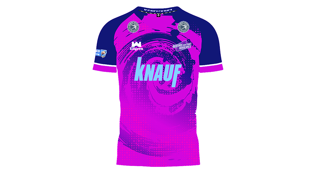
KEIGHLEY Cougars have done it before, Sheffield Eagles have done it in the past and now Midlands Hurricanes have followed suit in leaving supporters in no doubt what their name is.
Sticking with the magenta and purple combination they have had since their 2022 rebrand as the Hurricanes, their shirt this year now features an unmistakeable Hurricane design emblazoned on the front.
While some such bold designs have been harsh on the eye in the past, the mixture of non-solid edges and a subtle dotted design certainly breaks up the swirl, so like Bradford Bulls, Midlands have tried and succeeded to add an abstract design to their shirt.