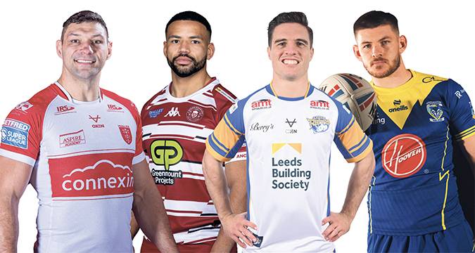
THE new season is fast approaching and no doubt many rugby league supporters – if not so keen on some of the more bizarre club shop offerings (see our article here) – will have asked Santa for their team’s new kit for Christmas.
Every Super League side’s fresh threads have been released, giving fans the chance to wear the red vee, black and white hoops or primrose and blue.
Here’s Rugby League World’s lowdown on each home jersey and our view (just for a bit of fun, of course) on what’s hot and what’s, erm, spot…
12) Leigh
Leigh caused quite the stir with their shirt last year, and while leopard print version two is a little more professional, it is even more garish.
The club have returned to their roots with red back on the palette, but lost a little of their new identity along the way – who has ever seen a red leopard?
The bold prints make it more in your face – just how club owner Derek Beaumont no doubt likes it – but the Leopards will need to overachieve again on the field this year to make up for this gruesome effort.
11) Warrington
Warrington thought they were being smart by, in their words, “mirroring the contour of the lower third of the wolf depicted in our logo” for their latest design.
But the unanimous reaction of the Rugby League World team was one of repulsion at a shirt trying a bit too hard to be edgy.
The line down each side – also a nod to the club crest, in this case the wires – is a decent touch, but the less said about the subtlety or otherwise of the main logo, the better.
10) Wigan
Did Wigan’s shirt get stuck in the sewing machine? It has certainly come out a bit funny.
The iconic cherry-and-white brand should be difficult to get wrong, but the Warriors have managed it with an array of misplaced stripes to make you queasy – unless the aim is to discombobulate opponents as they run at them?
The main sponsor logo again jars a little although that is less avoidable, and that’s certainly not the chief complaint of a design not befitting of Super League champions.
9) London
London’s identity has been a bit confused of late, what with a brief switch to Warrington-esque blue, but they’re back in black for their Super League return.
This kit is reminiscent of their best going all the way back to their Fulham days, although it is perhaps too plain in design.
While the appearance of an All Blacks jersey makes it look good on the surface, once the Broncos have recruited a full suite of sponsors following their promotion it will no doubt look a little different.
8) Huddersfield
It’s unmistakably a Huddersfield shirt, but just missing something to make it different to any other.
Perhaps it’s the gold, somewhat out of proportion to the claret, with pin stripes which don’t even go around the back.
The one notable departure from the recent norm is the combination with white shorts instead of claret, which may go down well with supporters.
7) Castleford
Castleford’s advertising slogan is that ‘amber is back’ – albeit only back in small quantities, it seems.
The club have steered towards orange in recent times, so where you stand in the great colour debate may determine your opinion of this shirt.
Otherwise it’s a neat and tidy design, with an attractive collar and a main sponsor logo that integrates well enough to get away with being massive.
6) Leeds
Leeds have gone for something different, and while it doesn’t immediately stand out as a Rhinos shirt, it is a sleek and attractive design.
The club are keen to point out that there is precedent for white – they won the 1910 Challenge Cup in the colour, long before Leeds United adopted it.
With the colours the other way around on a home shirt, this could have been the perfect away strip, with the blue and amber beautiful when used down the sides, on the sleeves and on the collar.
5) St Helens
St Helens. Red Vee. Can’t go too far wrong, can you?
Apart from a slightly shorter vee, and its two-tone design with fractionally different shades of red which is only evident close-up, there’s no great difference to the jersey worn by the world champions last year.
The sponsor logo ripping through the vee does grate a little but there are other nice touches including grey shards and a stylish collar.
4) Salford
First, the elephant on the shirt. That box is just awful, isn’t it? The same logo was used in white and integrated perfectly last year, but for some reason is now stuck on a giant square.
It’s a great shame, because it spoils an otherwise wonderfully classy shirt, which is almost entirely a beautiful deep red in an admirable attempt to reclaim their history as the original sporting ‘Red Devils’ in the region.
The pattern across the shirt strikes the perfect balance between being too subtle and too obvious, completing a truly stylish look.
3) Hull FC
Hull FC are back in a predominantly black kit and it’s a fine effort, with the integration of all the shirt sponsors once again giving it a fantastic monochrome effect.
The irregular hoops jar a little, while they only go around the front with an entirely black back to the shirt, but the subtle grey stripes work nicely.
Marks must, however, be taken off for their overall range of shirts – there is little ‘alternate’ about their dark blue-and-white away strip and dark grey third kit.
2) Catalans
Fresh from their run to the Super League Grand Final, Catalans have come up with one of their most stylish efforts yet.
Sticking with white as their squeaky-clean primary colour, the way that their secondary yellow and red are used is excellent.
For the vee across the shirt, the colours combine with a paint-splat pattern, giving a truly fresh and modern twist to what can often be a lifeless feature.
If that encapsulates the vibrant and colourful atmosphere of Stade Gilbert Brutus, it could be said that the sleeves represent the hostility of their Perpignan home to visitors, with an even deeper, darker red making an impression.
All the sponsors are integrated perfectly, with black on white over the body and white on red going down the sleeves.
The Dragons also get a thumbs up for being eco-friendly, with both the home shirt and their solid navy blue effort for away days being made from a polyester material entirely derived from recycled plastic.
1) Hull KR
Hull KR are a club going from strength to strength, on and off the field, and that is reflected in this beauty of a home kit that we reckon is the best of the lot in Super League.
It’s entirely in Hull KR tradition, with a red band taking pride of place in the middle alongside red sleeves, red shorts and red socks. Oh, and what a gorgeous shade of red it is as well.
With all sponsor logos integrated into the shirt, as white on red or red on white, the colour palette is pure perfection.
The sleeves are filled with sublimated robin icons, exactly matching those on the club logo, clear only from close up but making a neat effect from a distance too.
And while we’re only judging home shirts here, Hull KR surely have the best all-round range too, with equally stunning ‘marble’ blue and ‘electric’ pink alternate shirts. All three stand out, against both each other and previous designs.
Even better, the shirts all retail at £49.99 – only Leigh and London’s jerseys are cheaper amongst the home designs featured here. Value for money, to say the least.
First published in Rugby League World magazine, Issue 492 (January 2024)
Click here to subscribe to the print edition of Rugby League World