GOING into a new season is always exciting for clubs and their fans.
Filled with optimism about the campaign ahead, supporters often rally behind their club, buying season tickets and memberships as well as merchandise.
New kits are always a hit with fans – and no fewer than four clubs will have a new badge on their gear after going for a change of identity ahead of the 2026 season.
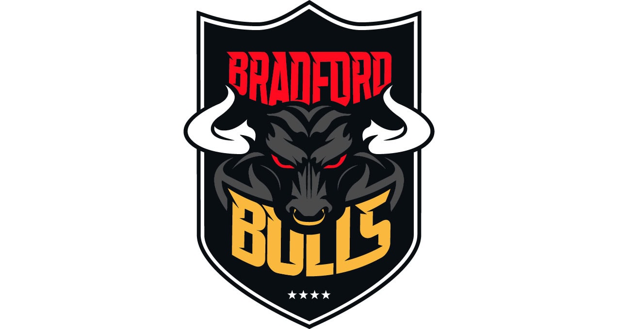
Bradford Bulls
There is a sleek new look for Bradford Bulls in their first season back in Super League for over a decade.
The club have replaced the previous crest which had been in use for 30 years, since their rebranding as ‘Bulls’ from Bradford Northern ahead of the switch to summer rugby in the 1990s.
The new crest includes four stars, representing the Super League titles won in 1997, 2001, 2003 and 2005, and of course the club’s traditional red, white, black and gold colours.
Bradford chief executive Jason Hirst said: “Our new club crest perfectly captures the direction of the future Bradford Bulls.
“It’s more confident, aggressive and defiant, which is exactly the philosophy and approach we’ll be taking into Super League, both on the field and off it, in terms of our marketing and media approach.
“Whilst we have the same heart, the same pride, we’re also coming back as a different beast.”
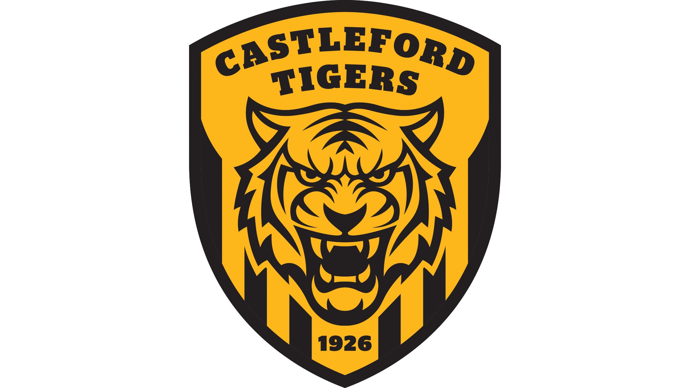
Castleford Tigers
As seen by the article’s main image, Castleford Tigers have adopted a new, modern look for 2026 as well, in which will be the club’s centenary year.
Featuring a more modern tiger, the badge sits within a Roman shield, pointing to the history of the town of Castleford’s coat of arms, with stripes running through the shield inspired by the club’s Challenge Cup winning 1986 shirt.
Owner Martin Jepson said: “For too long we have seen inconsistencies in the club’s colours and branding, and this new approach gives us the opportunity to start again with a strong and recognisable badge, steeped in our history.
“We have many improvements to make on the field, but those must be supported by a new approach to everything off the pitch too – and this will go a long way to helping us achieve that.”
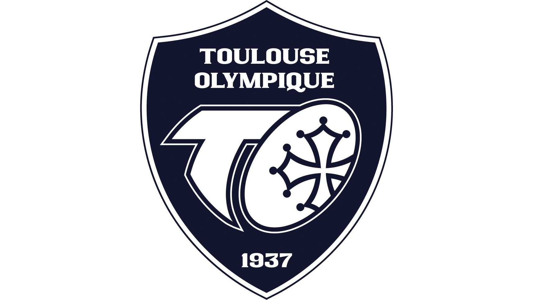
Toulouse Olympique
Another new Super League side for 2026, Toulouse Olympique have undergone a major transformation, too.
The French club described it as a “symbol of ambition, unity, and renewal” and it has been part of a modernisation of the club which also includes a new kit brand deal with sports giant Hummel.
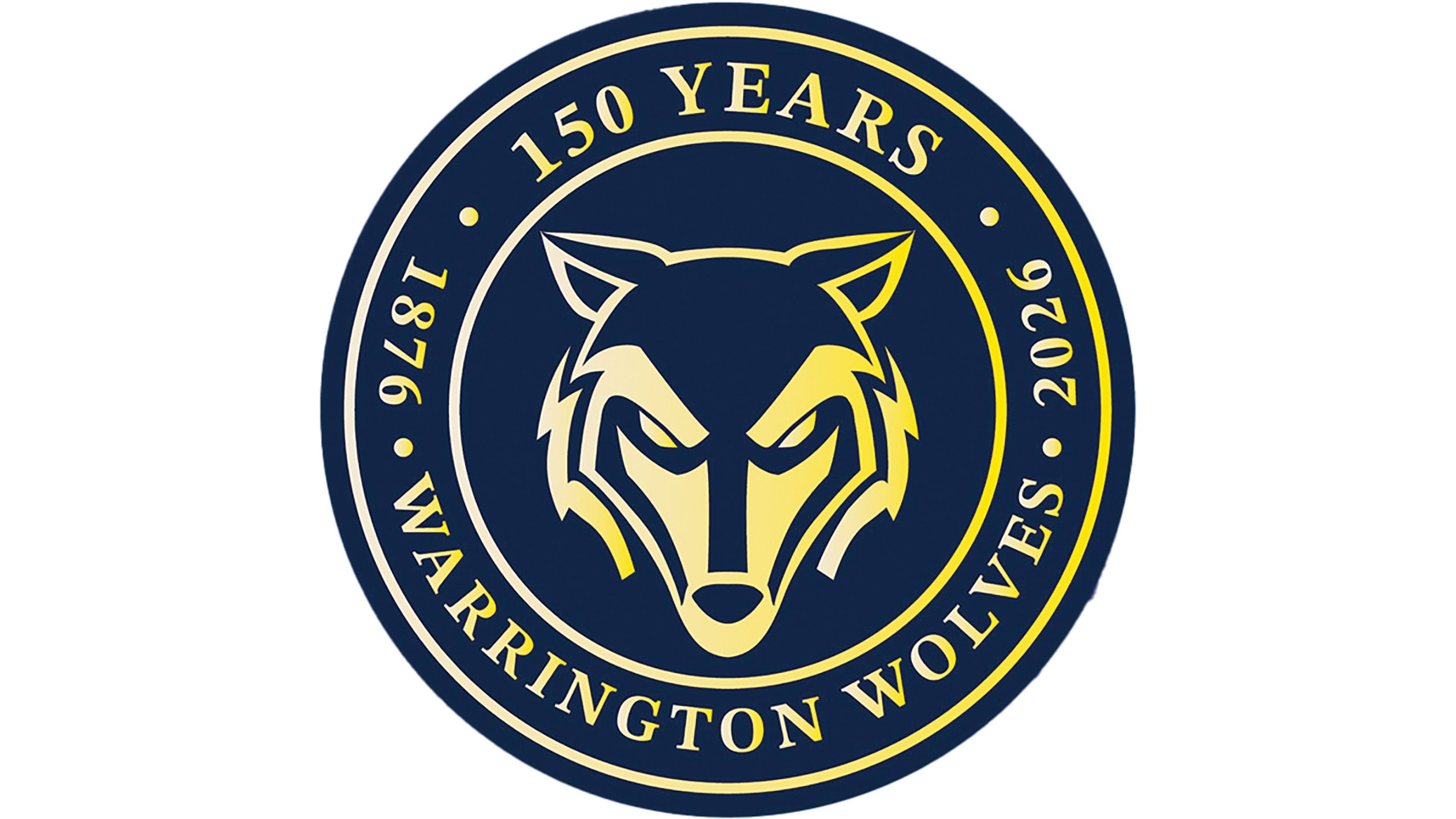
Warrington Wolves
Another nod to an anniversary – this time for 150 years – Warrington Wolves launched their special logo for the 2026 season only.
At the heart of the crest is the club’s emblem, the iconic wolf’s head in a circular design with ‘150 Years (1876–2026)’ framed around it.
A range of heritage initiatives will also be launched by Warrington which includes the publication of three books created by club historians that capture memories from across the decades, covering the winter era, the summer era and a collection of 150 club legends.